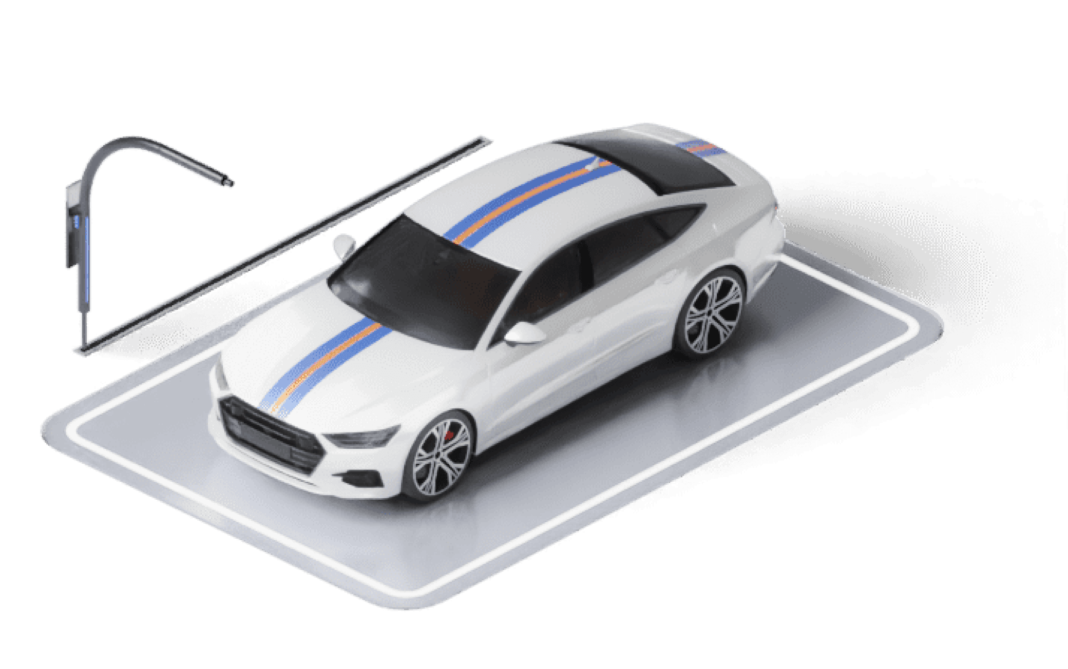
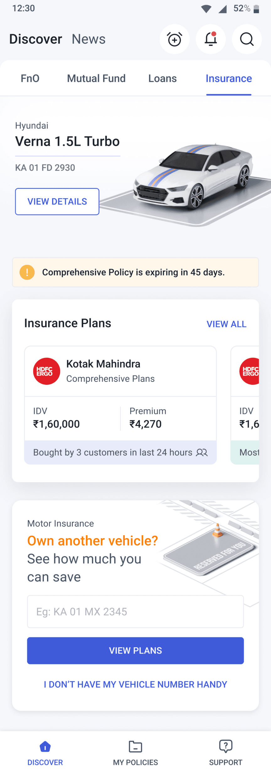
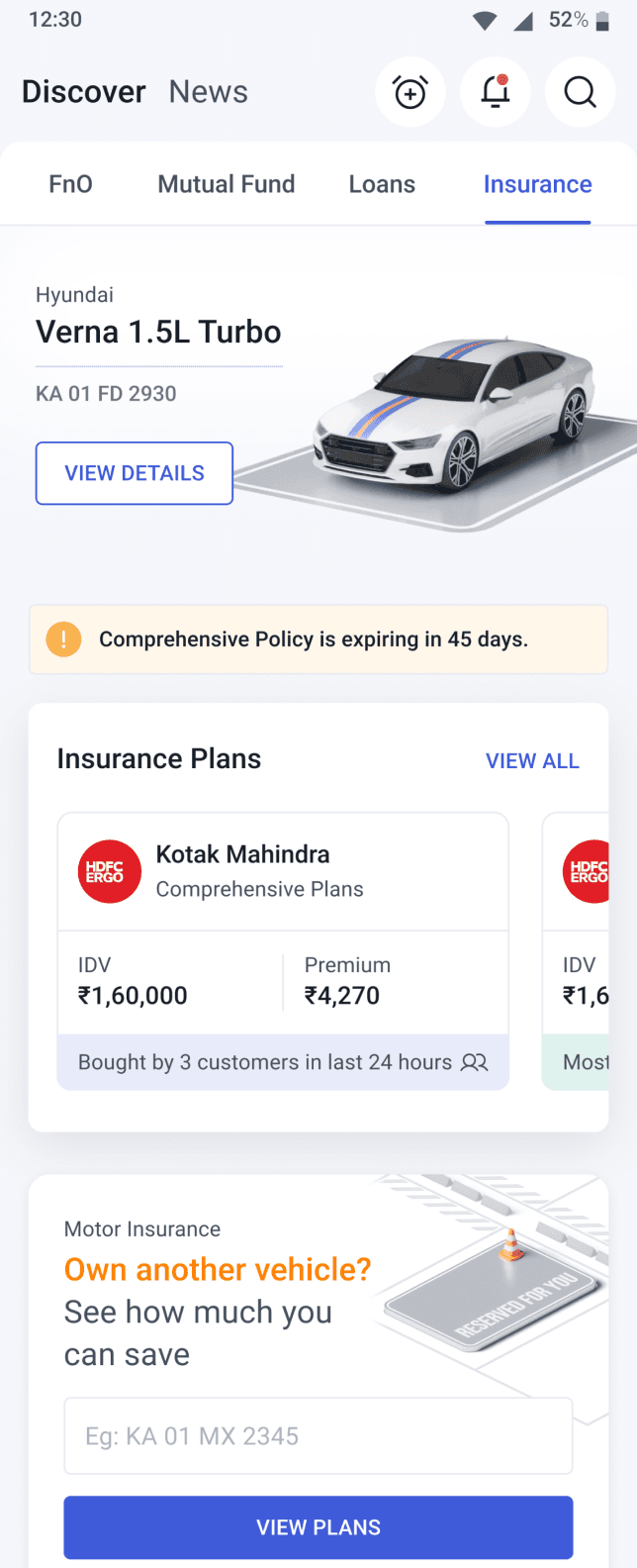
Motor Insurance
Beta-Ready:
Iterating on the MVP
My Role
Lead Product Designer
Team
Cross-functional collaboration
with UI Designer and AngelOne's Product & Development teams
Timeline:
December 2024 – Present
Missed the foundation behind it?
Check out Phase 1 for the background
MVP design (Phase 1) was an extensive phase which built Motor Insurance from ground up.
185.7% Growth in Policy Sales Post Beta Launch
We launched the beta version of our insurance platform to 60,000 users. While adoption looked promising, our post-launch analysis uncovered key drop-offs and low engagement across critical user journeys.
This case study outlines how we:
Identified engagement gaps
Iterated on solutions through data-backed design
Uncovered design and behavioral issues
This validated the product-market fit and informed the next phase of rollout.
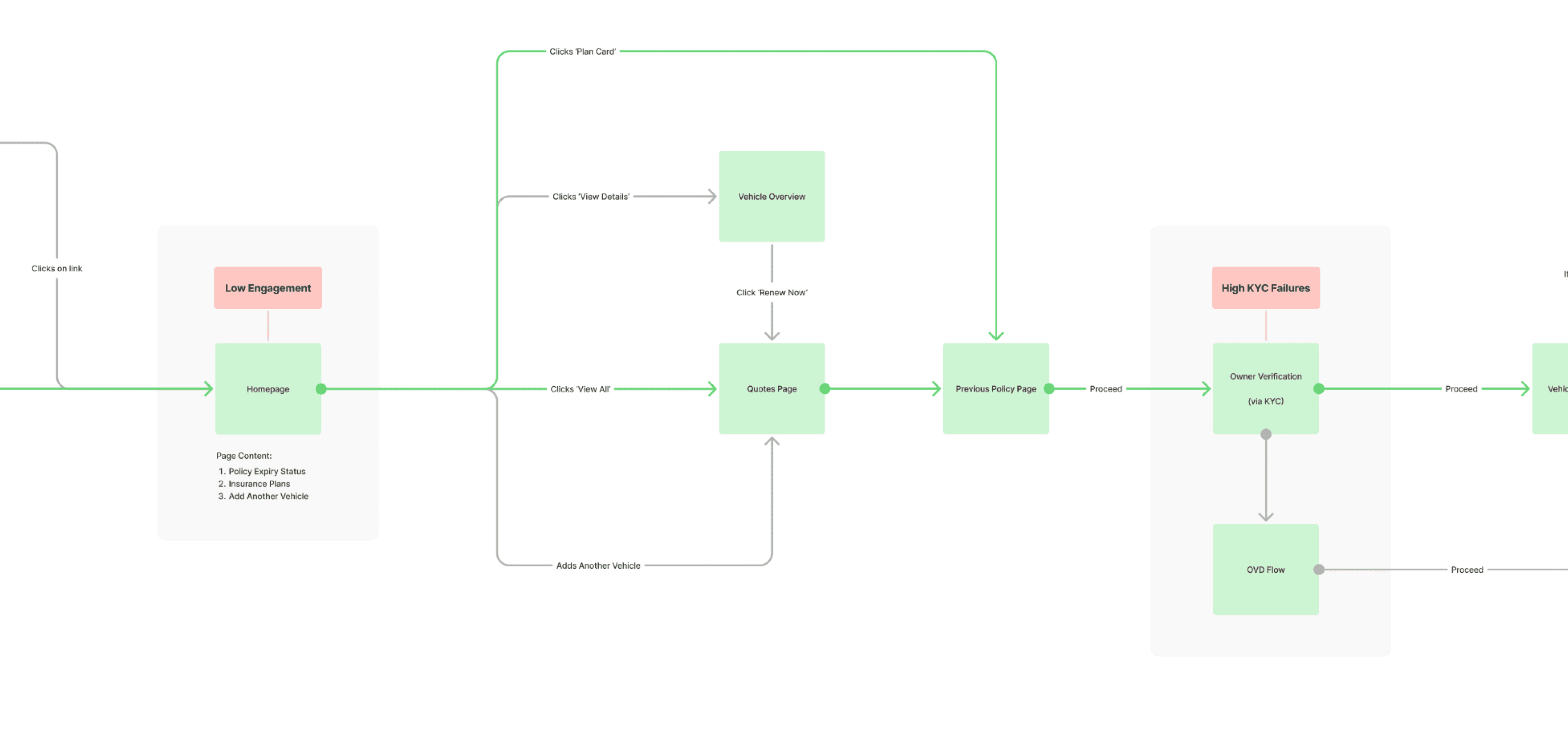
Click the image to view entire user flow
Key Impact Areas
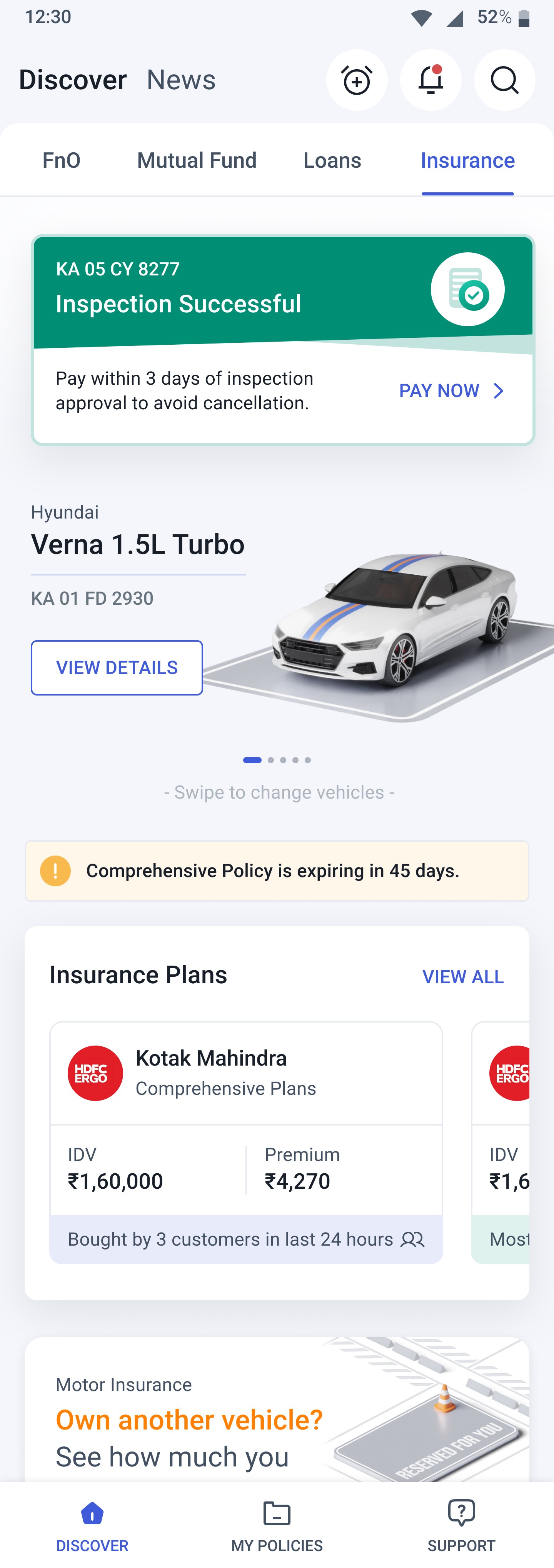
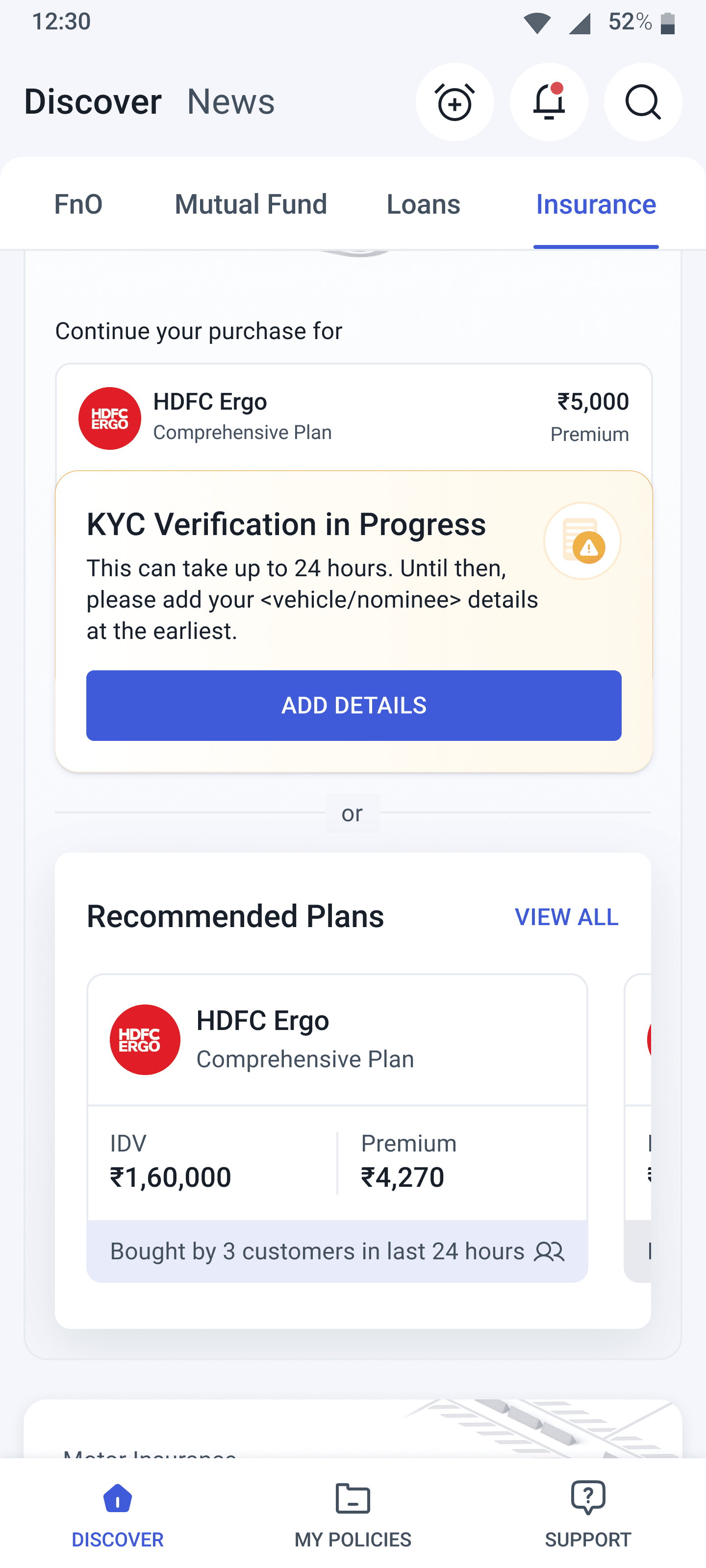
Low Engagement on Homepage
Impact: 113.2% increase in Quote Page visits
Result: Improved content visibility and structure led to more users exploring insurance plans.
KYC Drop-Offs (To be added in detail soon)
Impact: Improved KYC success rate by 38.4%
Result: Targeted flow optimizations and user intervention strategies reduced KYC drop-offs
aaa
Detailed breakdown to be included shortly.
01
Returning Users
Addressing Low Engagement on Homepage
After the beta launch, we saw a notable drop in engagement, especially around our core goal: driving insurance renewals. Key metrics highlighted critical drop-off points across the user journey.

Key Insights
Bounce Rate
56.2%
(Users were leaving without engaging)
CTA Click Rate (View All) Rate
22.7%
(Low interest in exploring plans)
Uncovering Why Users Didn't Engage
User intent:
Renew insurance easily
Not grabbing attention
Low Urgency Perception
Low Visibility, High Drop off
Missed Core Action
Positioning Problem
Low Exploration Rates
Low visual priority
Leads to passive scanning, not active clicking
Visually dominant but disconnected from car context
Perceived as Primary Action
Causes Misguided Clicks
(Opportunity to merge inspection task here)
Top Problems Identified
Lack of Clear Primary Action
Cognitive Overload: Multiple CTAs create confusion instead of guiding users toward one key action.
Lack of Motivating Message
The experience doesn’t create urgency or emotional drive to complete the renewal. It feels optional rather than essential.
Weak Urgency Triggers
While there's a generic expiry status message, it lacks emotional impact. No FOMO or risk-based prompts are present.
Disconnected Journey
Users coming from reminders or notifications don’t see continuity.
The page fails to acknowledge or reinforce their original intent.
Design Goal
Our goal was to clean up UI/UX friction, make high-priority actions more prominent, and improve the flow for users nearing insurance expiry.
No clear
CTA
Highlight a single action
Faster user decisions
Lack of
Urgency
Add emotional triggers
Increased engagement
Disconnected Journey
Personalize touchpoints
Higher task completion
Weak Visual Priority
Reorganize layout
Reduced
drop-offs
Faster user decisions
Increased engagement
Higher task completion
Reduced
drop-offs
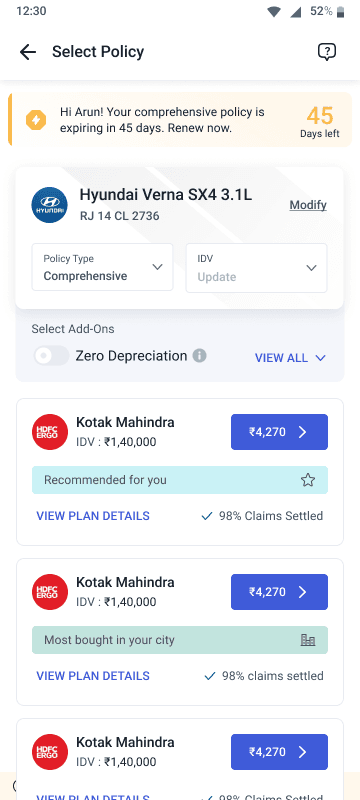
25+ Scenarios Designed
across all stages of the purchase journey adhering to guided flow and visual consistency
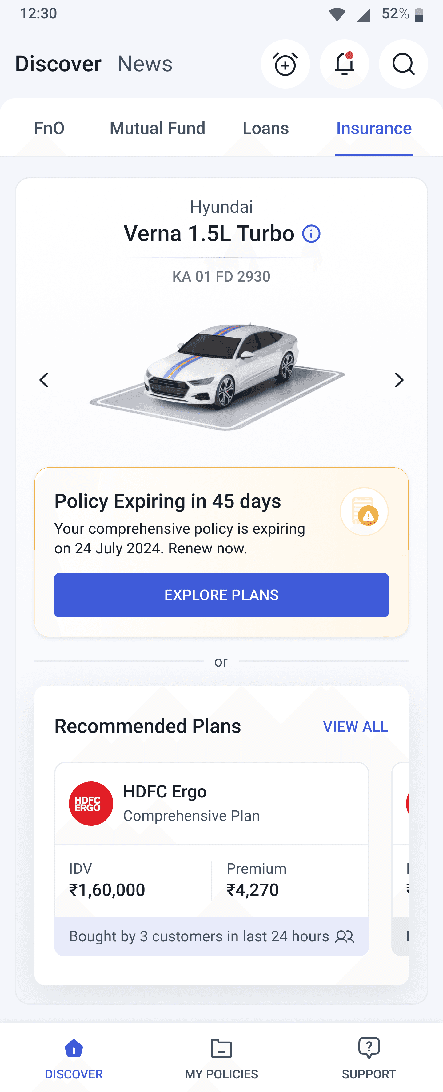
Simplified Navigation
Replaces carousel for better clarity and discoverability.
Urgency cue
Prominent expiry to prompt quick action.
Dual entry points
Caters to both proactive users (explore CTA) and casual scrollers (recommendations).
Vehicle details deemphasized
Kept subtle to reduce cognitive load and maintain focus on renewal actions.
Sticky plan visibility
Keeps plan options visible to boost conversions.
Elevated critical info like vehicle, plan status, and CTAs—reducing scan time and guiding user flow from recognition to action.
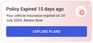
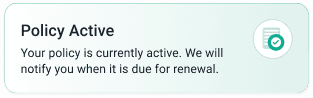
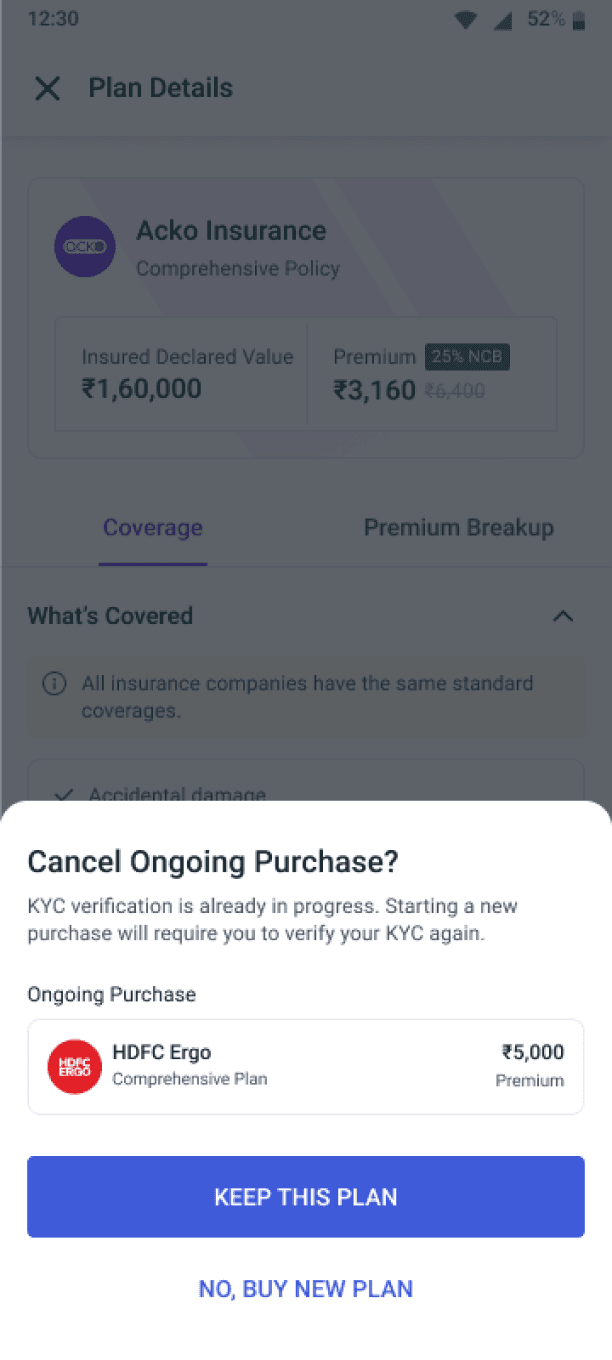
Strategic Friction to Safeguard Ongoing Purchase
Purpose: Prevent accidental drop-offs, compliance issues, and user confusion.
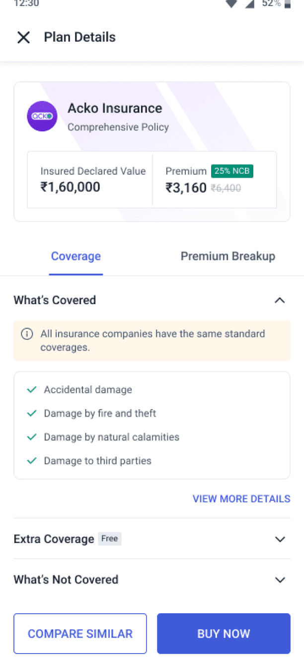
Click “view all”
Click “Plan Card”
Click “Premium CTA”
Click “plan details”
Click “Buy Now”
Contextual Reminder
to prevent unintentional restarts
User Retention
via "Keep This Plan" prompt
Informed Switching
with purchase awareness
Compliance Assurance
by blocking duplicate KYC submissions
Error Prevention
by avoiding data overwrite
Impact of Design Interventions
Boosting Engagement & Conversion with a New CTA Strategy
Explore Plans CTA Addition
Clicked by
46.9%
users post-launch
Strong Engagement validated user curiosity and improved discovery pathways
Impact on Conversion Funnel
Conversion to Quote Page:
From
41.5%
to
88.5%
That is a
+113.2%
relative increase
Driven by clear navigation and added entry points
Old Design
New Design
Check out the previous phase!
Minimal Viable Product
AngelOne's first-ever insurance product caters to 20+ million users, redefining the digital insurance experience.